How to build the best Hurree Dashboard 

How to build the best Hurree Dashboard 

How to build the best Hurree Dashboard 

The purpose of reporting dashboards is to make collecting, monitoring and analysing data simpler for your business. With minimal effort or analysis, you can gain an instant overview of your performance with all key metrics displayed clearly in the format that’s most meaningful to you.

The purpose of reporting dashboards is to make collecting, monitoring and analysing data simpler for your business. With minimal effort or analysis, you can gain an instant overview of your performance with all key metrics displayed clearly in the format that’s most meaningful to you.

The purpose of reporting dashboards is to make collecting, monitoring and analysing data simpler for your business. With minimal effort or analysis, you can gain an instant overview of your performance with all key metrics displayed clearly in the format that’s most meaningful to you.

Getting Started

Having a cluttered dashboard that’s overcomplicated and unclear is counterproductive. Whether you’re starting for the first time or creating your 100th dashboard, without a proper plan or structure, it can quickly become overwhelming, leaving you more confused than before you began. 


Start on the right foot with our simple cheat sheet full of tips on how to easily build brilliant Hurree dashboards that keep you on track and help drive data-driven decision-making.

Start with a clearly defined purpose 

Although many people generally start a dashboard with the idea that it should be all singing, all dancing, the reality is that cramming too much onto one dashboard results in a chaotic space that doesn’t deliver valuable insights.


Before starting with any dashboard, there are some key questions you should ask yourself: 


  • Why am I creating this dashboard and how will it improve my current processes? 

  • Who is it for? 

  • What’s the end goal?


Once you have answered these key questions, it’ll be easier to design your dashboard and ensure you are including only the most useful information. 


Also, rather than creating one big dashboard that includes an overwhelming number of widgets, try creating smaller specific boards that are more focused and easy to understand. For example, a dashboard to track ads and a separate dashboard to track social media. 


Only include the most relevant content - Don’t overdo it 

Once you have a goal in mind for your board, the next step is to add your content. With a defined purpose you’d assume it would be simple to choose the relevant metrics but sometimes this isn't always the case.


Many first time users often find themselves stuck deciding, “What datapoints should I be tracking?” And without much thought, simply add everything and completely overcomplicate their dashboard. 


It’s important to keep your widgets focused - don’t add multiple datapoints that ultimately say the same thing. Remember what’s most important to your team, and keep in mind your board purpose at every opportunity.


Most dashboard experts follow the 10-second rule, i.e readers should be able to understand the important information within 10 seconds or less. Essentially the more clear and concise your dashboard is, the more effective it will be.


It’s important to remember that your widgets can always be edited once added to your Hurree board so if you find you have made mistakes, you can easily go back and fix things at a later date.

Choose the right visuals 

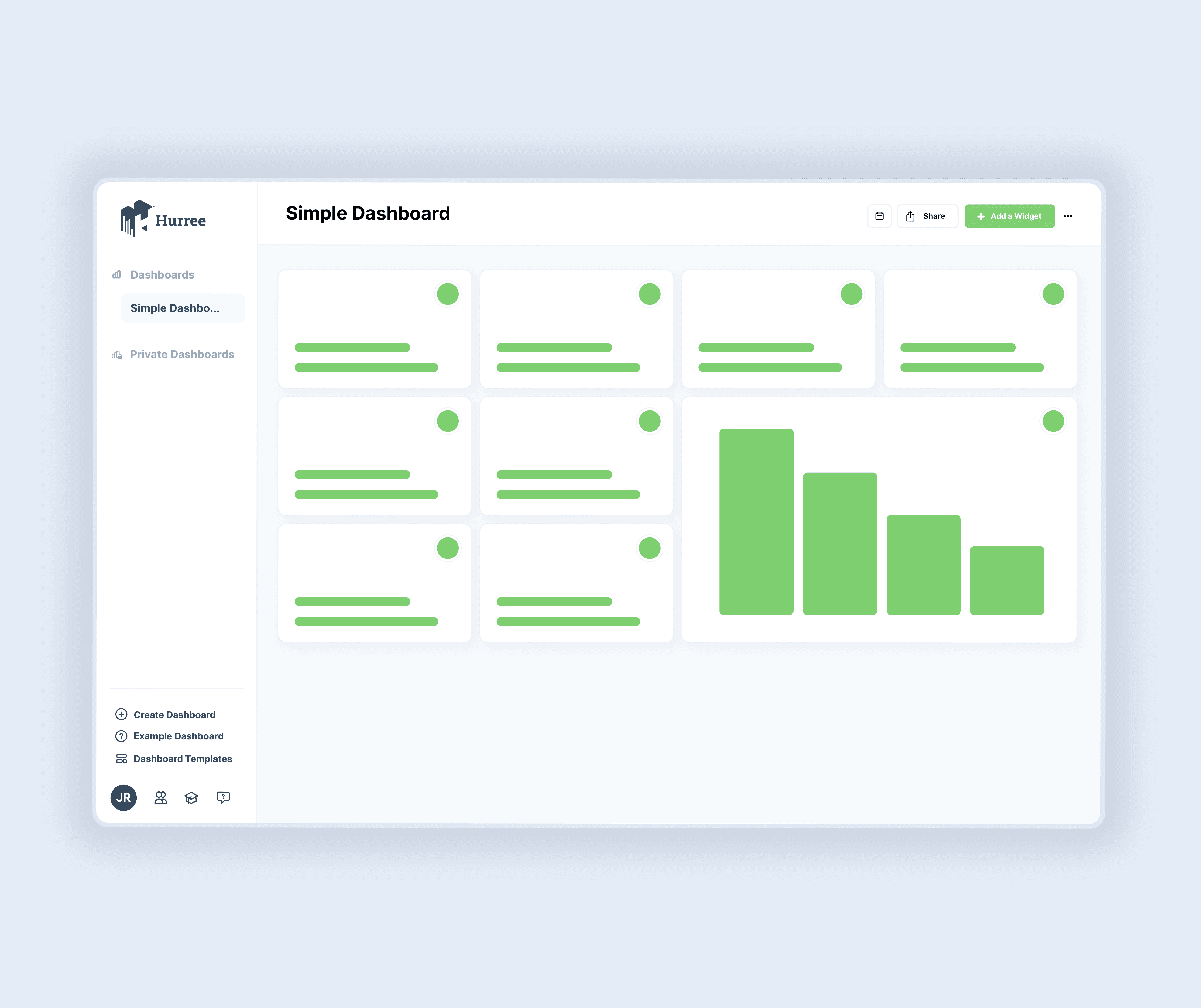
No one wants to work from boring and undynamic dashboards. Modern reporting dashboards give users a huge level of customisation which can be used to better display your data. 


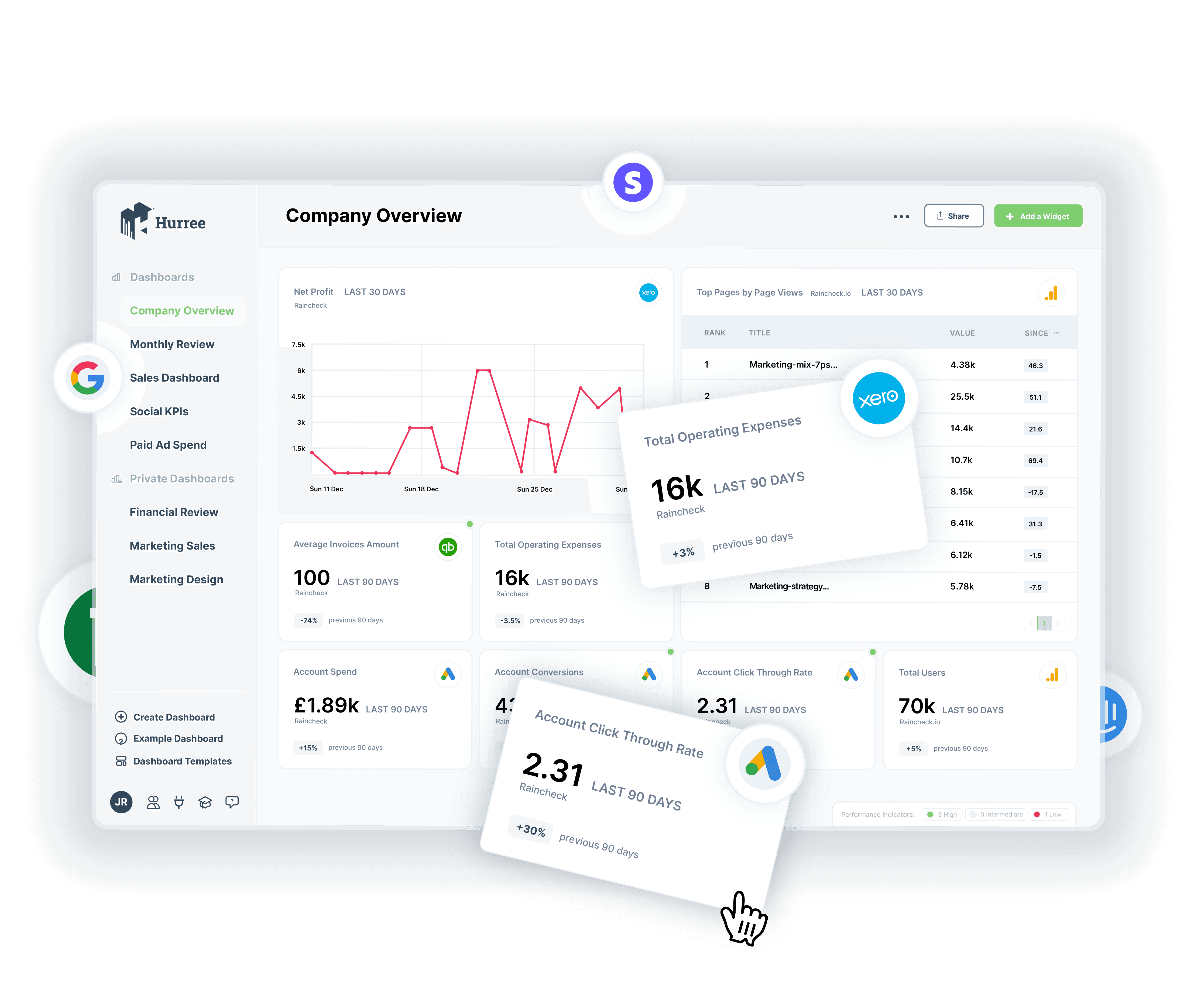
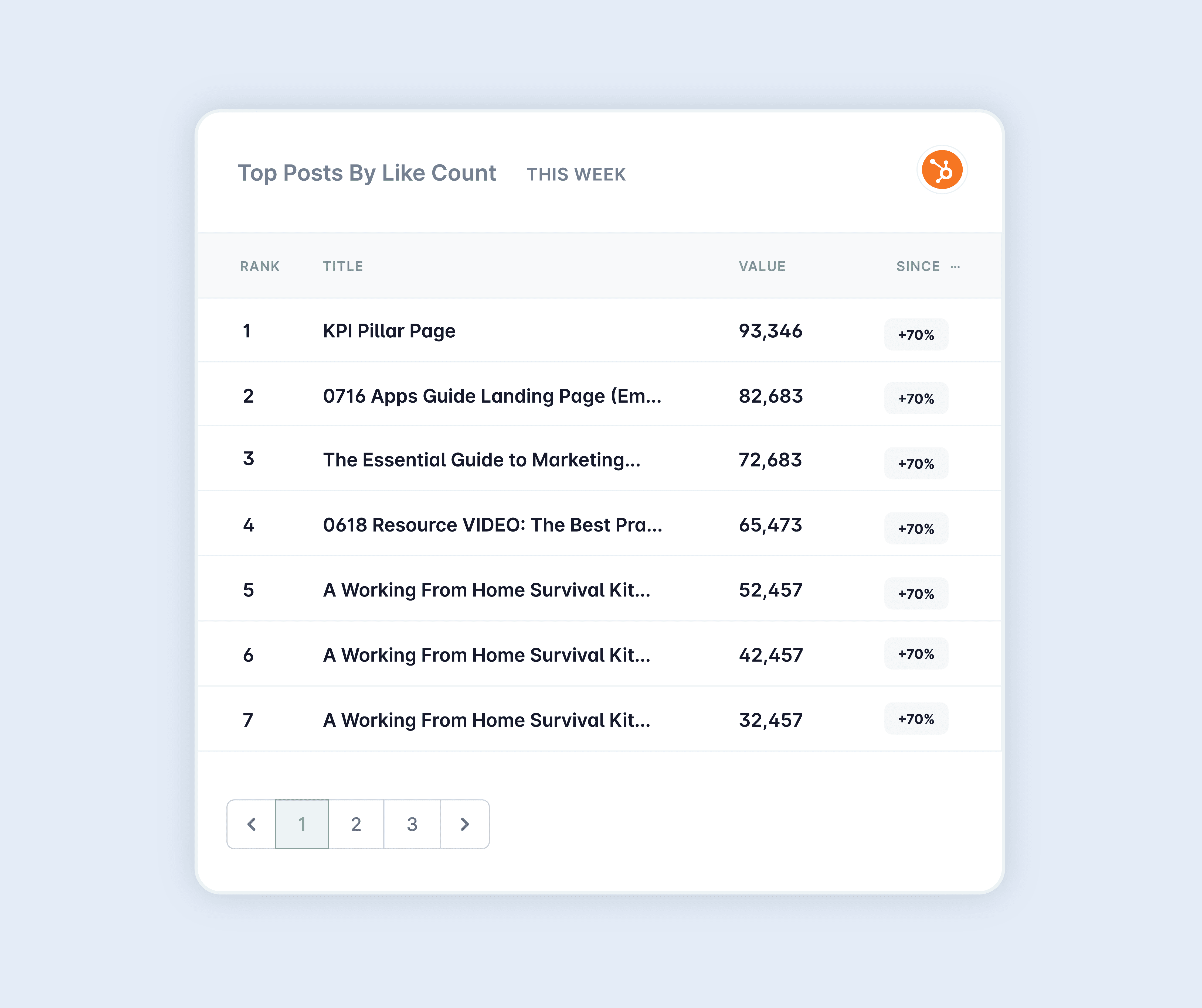
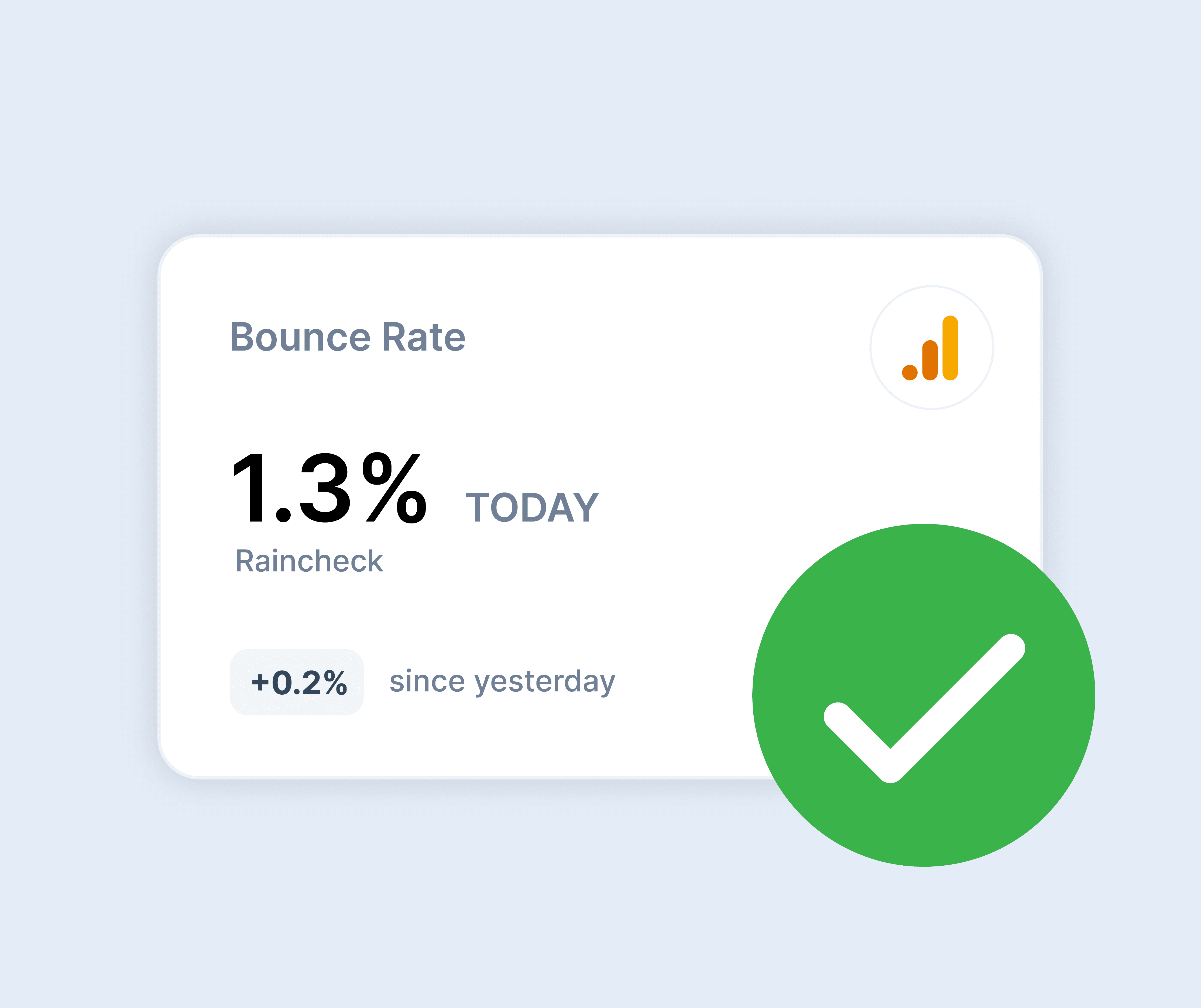
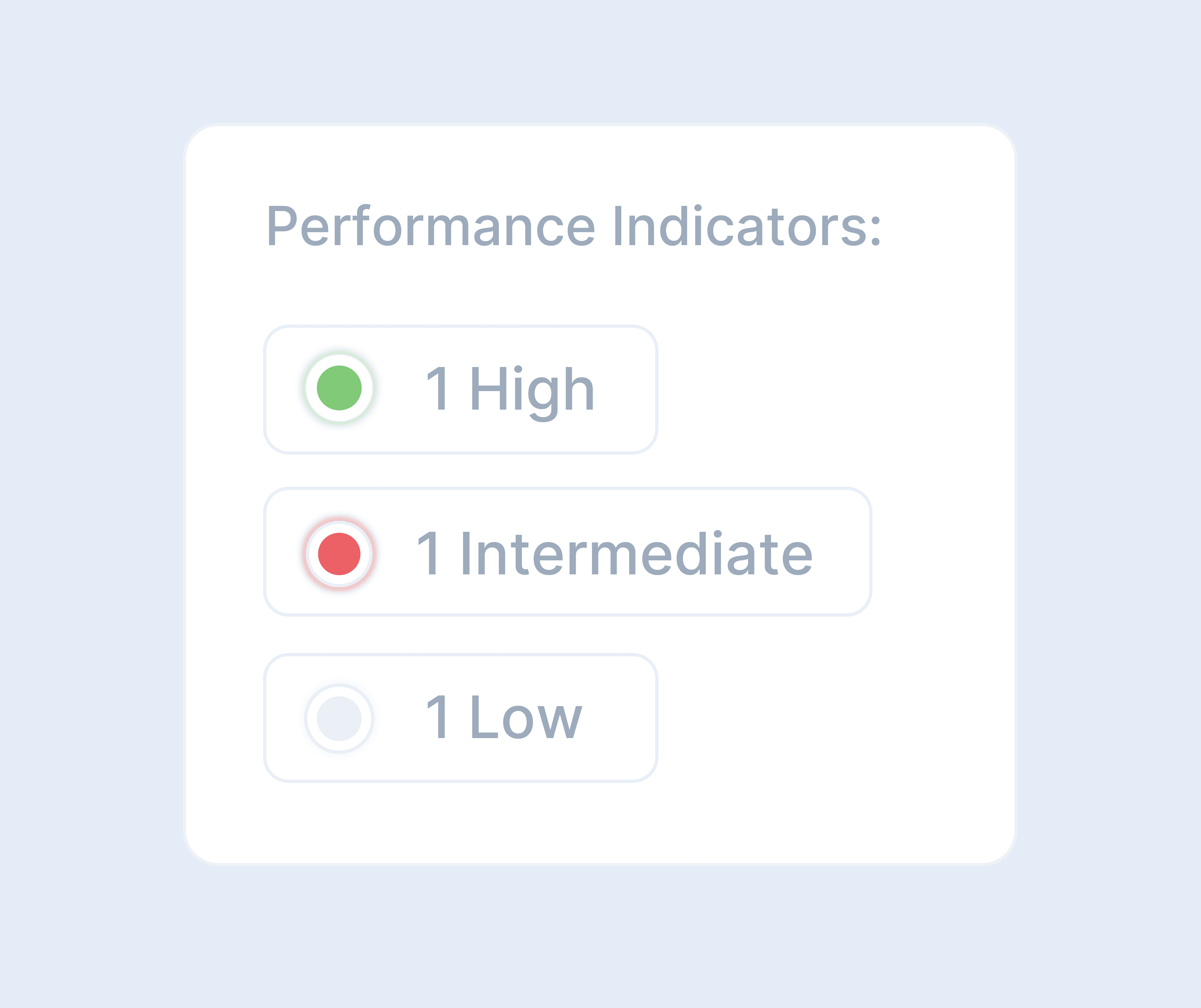
Within Hurree specifically, you have the option of bar charts, line graphs, numbers, lists and more.


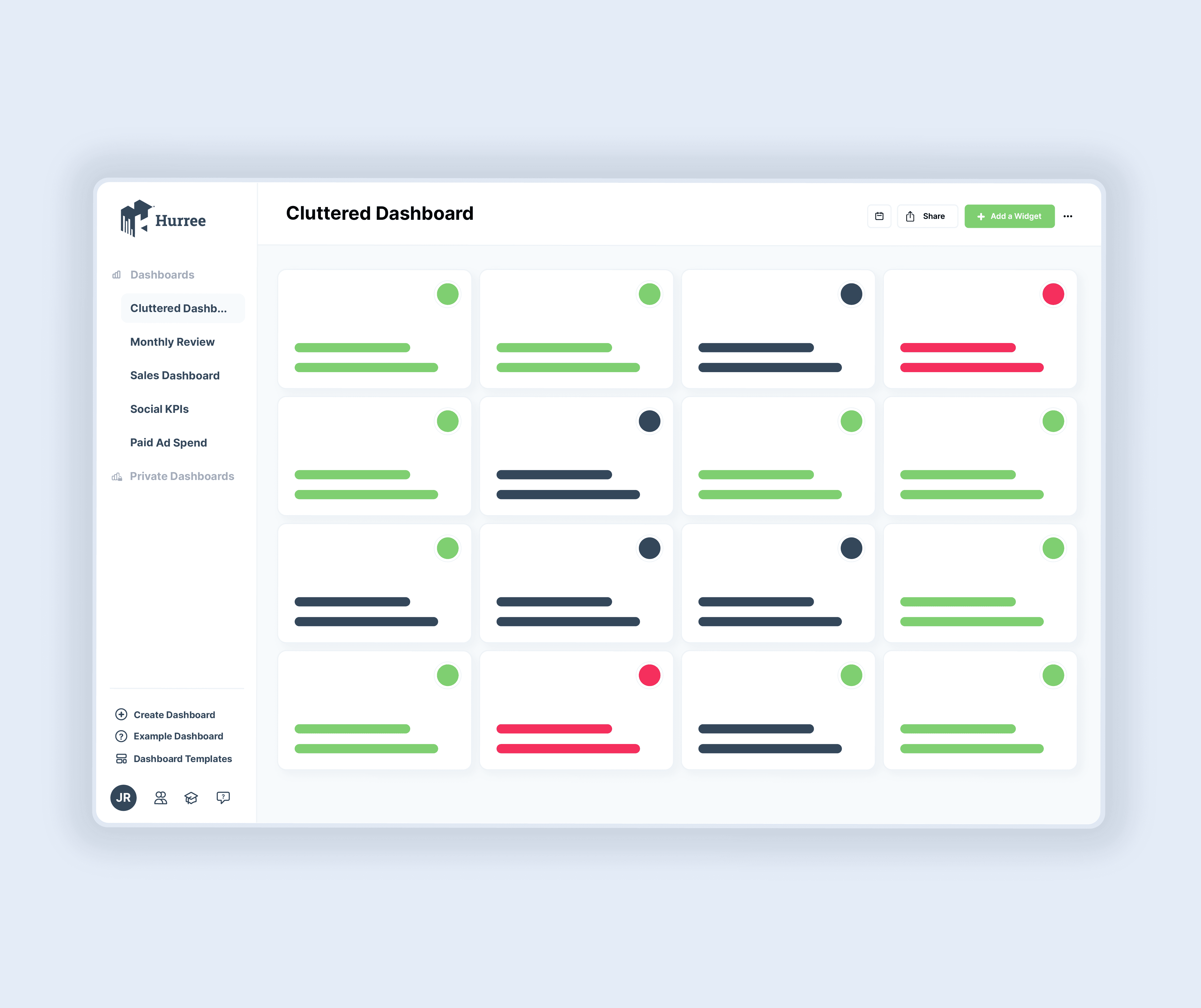
Although using different data visualisations is important for adding variety to your dashboard, it’s just as important not to overdo it. When designing your dashboard remember, it’s not about the number of visuals, it’s about choosing the right type, and ensuring they’re actually adding value. For example, if every single widget on your board is a graph or chart it quickly becomes loud and hard to recognise the key pieces of information. 


Essentially, try to keep things straightforward. Keep visualisations to 10 (at maximum) however, most dashboards will need much less than this. Simple numbered widgets are an equally effective way to display data and should make up the majority of your dashboard.


Choose a format that makes sense

Although it may not be the most important consideration when creating a dashboard, choosing the right format can greatly impact the effectiveness of your widgets. 


Within Hurree you can easily toggle between exact and rounded data formats. In most cases, rounded data is the most popular being easier to read and digest at a glance. 


For example, rather than 2.37694% your widget will simply round this to 2.4%.


Most users will prefer rounded data however, if the purpose of your dashboard is to drive strategy or C-suite reporting, you may prefer to keep your data highly specific. The format of your data will depend on your board’s purpose and is something that needs to be considered early on.

Set performance indicators

Although not mandatory or necessary for every widget, by setting specific performance indicators you’re making it easier to get an instant overview of your performance. This simple visualisation of key metrics is one of the biggest benefits of dashboards. 


Without going into too much detail you can easily evaluate (in real-time) where you and your team are performing well and what areas require improvement. It also gives anyone you share the dashboard with a clear understanding of whether the number shown is good, bad or normal.


Using Hurree, it’s super simple to set up performance indicators and edit them as you go, therefore an easy way to make your already brilliant dashboard even moreinsightful. There’s even a simple summary key at the bottom of your dashboard to do all of the hard work for you and alert you to anything that might require your attention.


Organise your widgets in a way that makes sense

As you build out your dashboard you will naturally begin to group information together, recognise trends and develop a hierarchy of information. The best dashboards will have their widgets clearly laid out to translate this hierarchy. 


Though simple drag and drop, you can rearrange your widgets in a way that makes sense to you and clearly displays your data. You can also use this function to signify relationships between certain datapoints and group together related pieces of information.


The best dashboards will also incorporate well-structured sections to efficiently organise your data. By grouping your widgets together in sections, at a glance, you can easily find the key pieces of information making analysis a breeze.

Get collaborative

What’s a brilliant dashboard if you don’t have anyone to share it with? 


Although dashboards can be used to track individual performance, they are ideal for collaboration between teams and even across departments. 


Dashboards help everyone, whether a team member, colleague, manager, stakeholder or external client, instantly understand your performance, giving context to future decision-making.  You can easily add and edit team members in your account settings or simply share your dashboard via email or link by generating an instant snapshot. 


Do you have individual or client boards you don’t want the rest of your company to see? Simply set these dashboards to private so that you have control over who sees what within your Hurree account.


Conclusion

Conclusion

Dashboards come in all shapes and sizes and have transformed how businesses view and use their data. No matter what the purpose of your dashboard is, the important thing is that it is built with thought and includes data that’s actually valuable. By following these simple steps you can ensure your dashboard is optimised and fit for purpose.


Still not sure where to get started? Try one of our pre-built templates and build your first dashboard in a matter of minutes.

Check out our pricing plans.

From our free-forever version, right through to building a complete custom package,
we have a monthly plan to suit your reporting needs. Sign up for our
quarterly or yearly plans to save $$. 

© 2023 Hurree, Inc. All rights reserved.


All trademarks, logos, and brand names are the property of their respective owners.

© 2023 Hurree, Inc. All rights reserved.


All trademarks, logos, and brand names are the property of their respective owners.

Terms of Service

Privacy Policy

© 2023 Hurree, Inc. All rights reserved.


All trademarks, logos, and brand names are the property of their respective owners.

Terms of Service

Privacy Policy

Check out our pricing plans.

From our free-forever version, right through to building a complete custom package, we have a monthly plan to suit your reporting needs. Sign up for our quarterly or yearly plans to save $$.